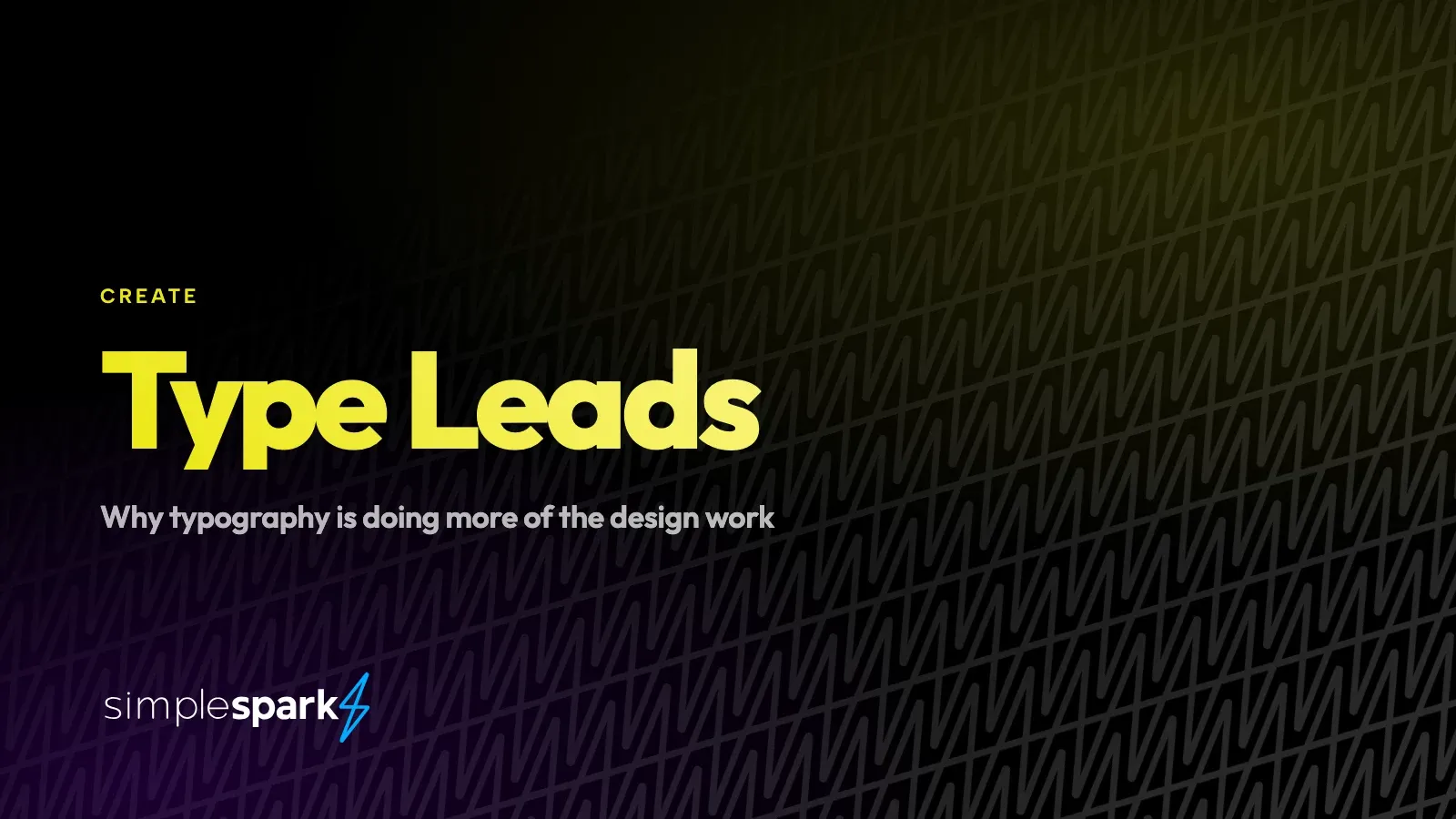
Look at the sites and campaigns that feel current right now and you’ll notice what’s missing. No drop shadows on everything. No five-color gradient meshes. No carousel of overlapping cards with icons. Mostly: big type, a lot of space, one or two real photographs, and a single accent color used sparingly.
That’s not minimalism for its own sake, and it isn’t laziness. It’s a correction, and there are practical reasons behind it.
Why it’s happening
Effects got free, so they stopped signaling quality. When a gradient or a glassy panel required skill, using one said something about your standards. Every template has them now. Doing less is the only remaining way to look deliberate.
Screens got better and fonts got cheaper. A decade ago you had a dozen web-safe faces and fuzzy rendering. Now you can license something with real character, set it at 120 points, and have it look sharp on a phone. The tools caught up with the ambition.
Everything is read on a phone. On a five-inch screen, an elaborate layout collapses into a single column anyway. What survives that collapse is the type and the hierarchy. Designing type-first is designing for how people actually look at things.
Attention is shorter and the top of the page has to work. A big, clear statement does more in the first second than a clever composition. Type says the thing; decoration only decorates it.
What “type-led” actually means
It doesn’t mean big fonts. It means the words do the structural work that boxes, borders and icons used to do.
- Hierarchy is made with size and weight, not with rules and containers. If the headline is four times the size of the body, you don’t need a box around it to say it’s important.
- Space does the separating. Generous margins between sections replace the dividers.
- Emphasis is rationed. One thing per screen gets to be loud. If three things shout, nothing does.
- Color supports, it doesn’t carry. Mostly black and white, with an accent doing one job — usually pointing at the action.
- Photography earns its place. One real, well-shot image beats four stock ones. If there isn’t a good photograph, the answer is often no photograph.
Why it suits smaller businesses especially
This is the part worth paying attention to if you’re not a national brand.
Type-led design is honest about what you have. Illustration-heavy, effect-heavy design needs a lot of assets to fill it, and when you don’t have them, you end up with stock images that make you look like everyone else. Type-led work needs a clear message and a handful of real photographs — which is achievable for a business of any size.
It’s also cheaper to maintain. A system built on two typefaces, a color and a spacing scale can be extended by your own team without it falling apart. A system built on bespoke illustration needs the illustrator every time.
And it ages more slowly. The gradient-and-blob look of a few years ago dates a site instantly. Well-set type in a face with some personality still looks composed in five years.
Where it goes wrong
Three failure modes, all common:
Big type with nothing to say. Setting a vague sentence at 100 points just makes the vagueness bigger. This approach demands better copy — there’s nowhere to hide.
Fashion over legibility. Ultra-thin weights at low contrast, tracking so tight the letters collide, body copy set too large to scan. If it’s hard to read, it’s failed, however good it looks in the mockup.
One typeface doing everything. A display face set at paragraph size is exhausting. Most good systems pair one face with character for headlines with a plain, comfortable one for body copy.
What we do here
Two faces. One for headlines with some personality, one for reading. A tight size scale, so headings relate to each other instead of being picked by eye. Black and white for almost everything, with our blue-to-purple used on the emphasis phrase and the one place we’re asking you to act. Photography of actual work, not stock.
That’s the whole system, and it’s deliberately small. Fewer moving parts means the fortieth page still looks like the first one — which matters more than any single page looking clever.
If your brand feels dated and you’re not sure why, the fix is often not more design. It’s better words, set well, with the room to be read.
Want the same treatment for your brand? We’ll show you what your message looks like when it gets the space it needs.